From Idea to Impact: Building Tools to Track Food Systems

When I reflect on the origins of the Food Systems Dashboard and the Food Systems Countdown Initiative, it really began back in 2017. At the time, I was the team lead in developing the High-Level Panel of Experts (HLPE) report on nutrition and food systems. During that process, my colleague, Lawrence Haddad, the head of Global Alliance for Improved Nutrition (GAIN) who also served on the report, kept coming back to the same idea: wouldn’t it be incredibly useful to have a tool, a dashboard, that could bring together key food system indicators to better assess how food systems are functioning? Specifically, we wanted to understand their performance in terms of improving diets, nutrition, health, and environmental outcomes.

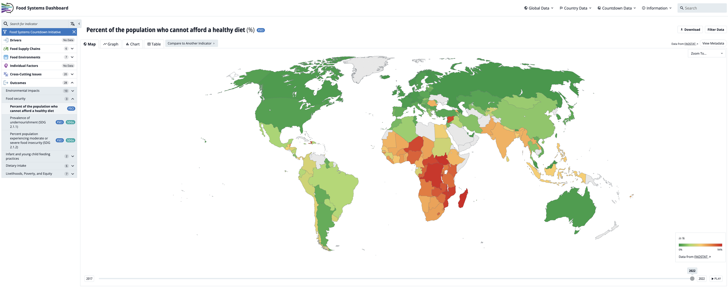
There was already a wealth of food-related data out there, of course — FAOSTAT being the most prominent example. That platform, managed by the Food and Agriculture Organization, offers a vast array of agricultural production and trade indicators. But what was missing was an accessible, visually engaging tool that integrated indicators across the entire food system — not just agriculture — and focused explicitly on outcomes related to diet quality, nutrition, and sustainability.

So in 2019, Lawrence and I decided to move from idea to action. We began building the Food Systems Dashboard. We brought on students and staff from Johns Hopkins and GAIN. Together, we started to build a platform that was both data-rich and easy to navigate.

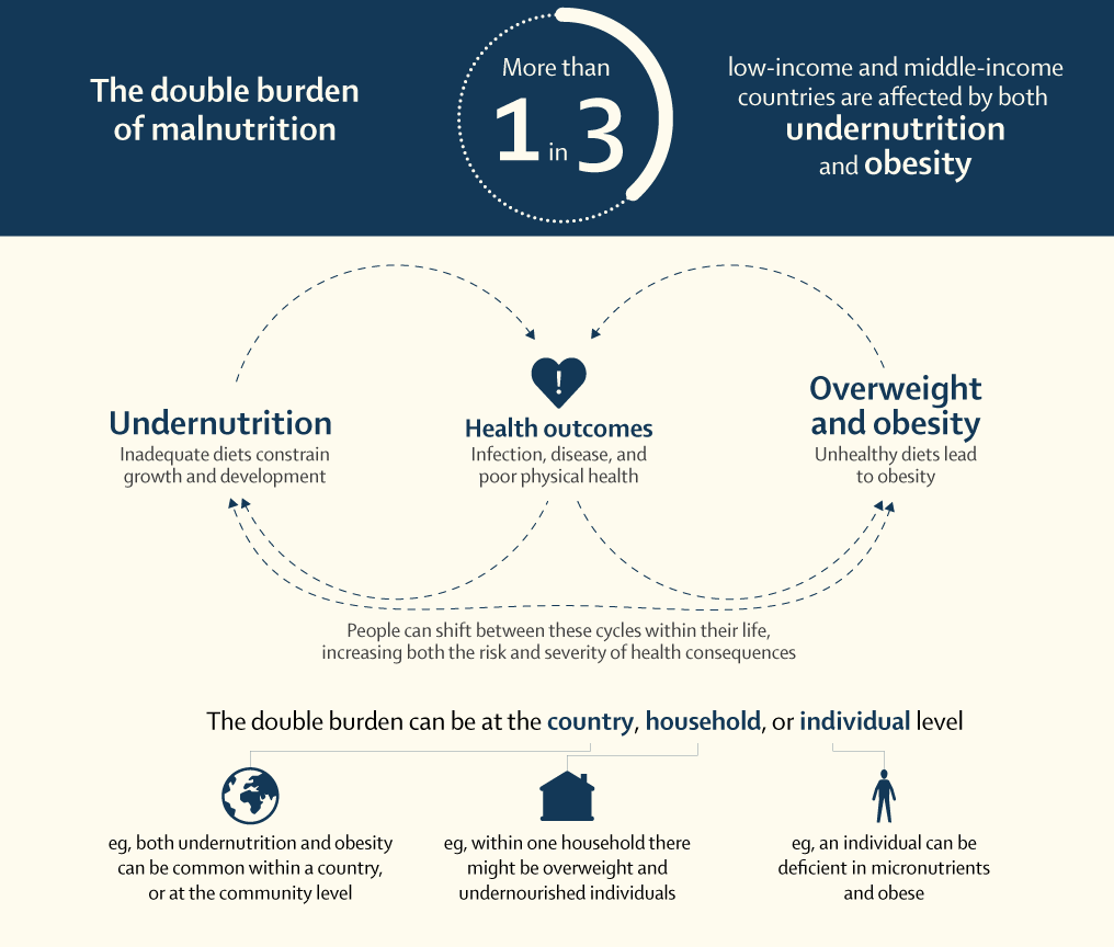
We grounded the dashboard in the HLPE food systems framework — now widely recognized — which spans food supply chains, food environments, and consumer behavior, with outcomes ranging from nutrition and health to environmental sustainability, social equity, and livelihoods. Our first version of the dashboard included a modest set of indicators mapped to that framework, but it laid the foundation for what would become a comprehensive tool for food systems monitoring and decision-making.

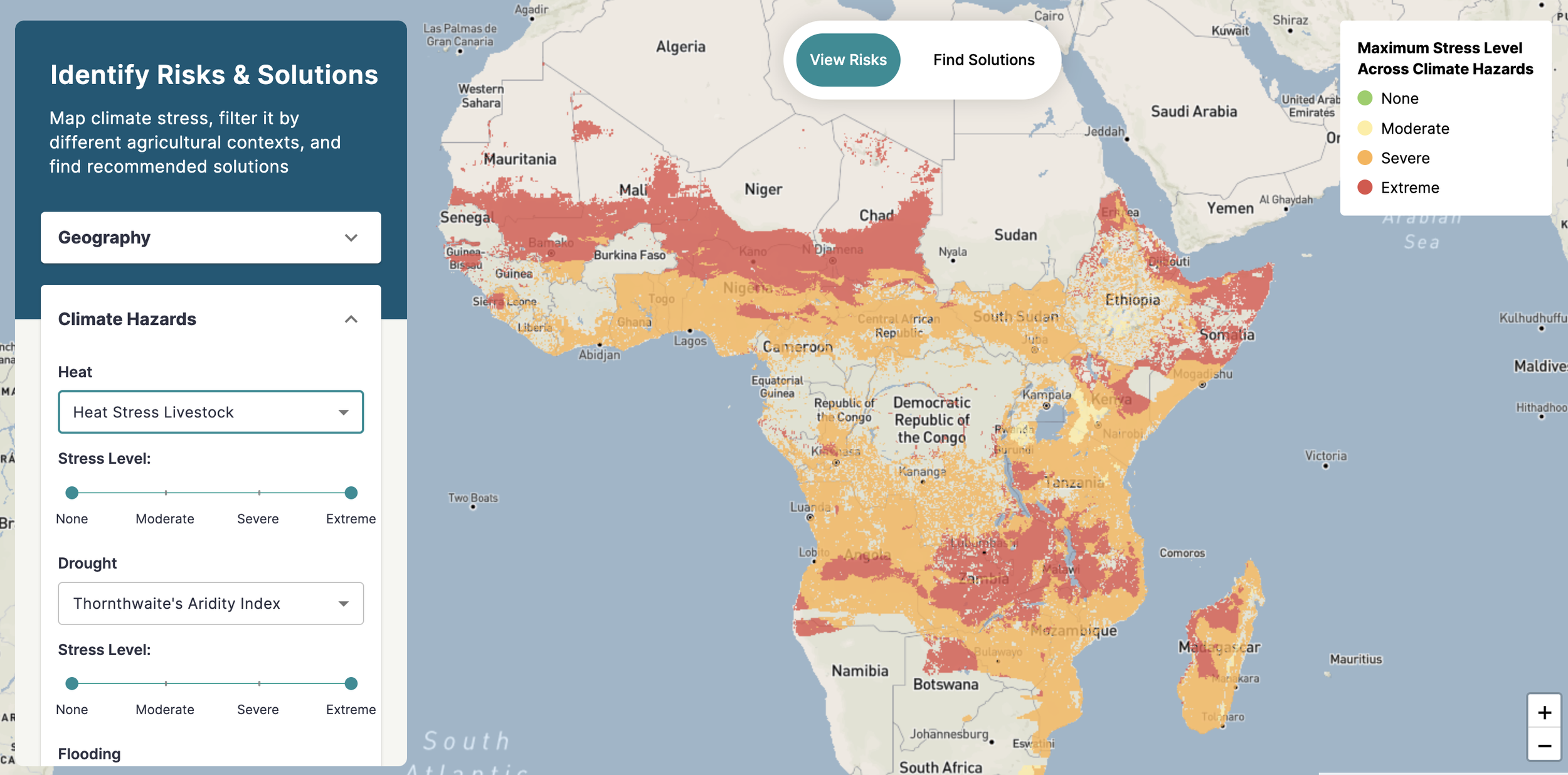
Over the years, the Food Systems Dashboard went through many iterations — from shifts in design to new web development partners — as we refined both its functionality and user experience. Today, we’re proud of what it’s become: a visually appealing, highly interactive platform that includes over 400 publicly available indicators spanning the breadth of food systems. The dashboard allows users to explore global trends and diagnostics, as well as dive into subnational data for a growing number of countries.

One of our core priorities throughout has been accessibility. You don’t need to be a data scientist to use the dashboard. We designed it to be intuitive and user-friendly, making it easier for policymakers, researchers, advocates, and even the general public to understand how food systems are performing across nutrition, health, equity, and sustainability dimensions. It’s taken us six or seven years of steady development to get here, and the work is ongoing.

Then, in 2021, the UN Food Systems Summit took place — a pivotal moment for the global food systems community. But as the summit unfolded, it became clear that something was missing: an accountability mechanism. There was no system in place to track whether countries were making meaningful investments in their food systems, implementing reforms, or strengthening governance. We realized there was an urgent need for a global monitoring and accountability framework.

Drawing on the lessons from the Dashboard, we launched the Food Systems Countdown Initiative (FSCI), bringing together more than 40 food systems experts from every region of the world. Our goal was to design a scientifically robust, policy-relevant framework that could monitor progress across five critical domains:

1.     Diets, nutrition, and health

2.     Environment, natural resources and production

3.     Livelihoods, poverty and equity

4.     Resilience

5.     Governance

We identified 50 core indicators and mapped them to these domains, creating a baseline for global food systems accountability. Since then, we’ve published a series of papers — starting with the architecture paper that outlined the rationale and framework, followed by a baseline assessment, and most recently, a trends analysis. Each peer-reviewed paper is accompanied by a more accessible policy brief to ensure broader reach and usability.

This year, we’re adding another key layer: benchmarks for each of the 50 indicators. These benchmarks help assess how far the world is from reaching key 2030 targets, highlighting areas of progress — and places where we’re falling behind. Keep an eye out for that paper when it is published later this year, early next year.

Together, the Food Systems Dashboard and the Food Systems Countdown Initiative offer two complementary tools for evidence generation and accountability. They help bring data to the center of food systems transformation — enabling better decisions, identifying where interventions are most needed, and holding governments and other actors accountable for action (or inaction). Ultimately, we aim to spotlight both the possibilities and the pitfalls — to show where food systems are delivering on their promise, and where deeper change is urgently required.

As food systems become more complex and interlinked, the tools used to measure and monitor them must evolve accordingly. In a new IFPRI publication—What do we know about the future of food systems—we call for a new generation of indicators and data systems that can capture the synergies, trade-offs, and dynamic interactions within food systems, while remaining transparent, interoperable, and policy-relevant. Our chapter highlights the role of initiatives like the FSCI to monitor global progress, and argues for integrating foresight modeling, historical data, and systems science into measurement efforts. Ultimately, we make the case for harmonized, forward-looking data infrastructure that enables smarter decision-making and accountability in food systems transformation.

Here are some resources where you can find lots of material on both tools:

Food Systems Dashboard website

FSD brief

Food Systems Countdown Initiative website

FSCI brief

Lending order to the world

Robert Rundstrum said that creating maps is fundamental to lending order to the world. I geek out over maps, dashboards, and overall visuals of how data can be creatively displayed. So much so that I co-lead the Food Systems Dashboard with our friends at GAIN, which gives a complete view of food systems by bringing together data from multiple sources. The Dashboard allows one to compare food system drivers and components across countries and regions, gain insights into challenges, and identify actions to improve nutrition, health, and environmental outcomes.

Dashboards are maps, and often, they are displayed as maps. Maybe my obsession with maps comes from how much time I spend walking with my better half, stepping across geography step by step. As Rebecca Solnit said,

“A labyrinth is a symbolic journey . . . but it is a map we can really walk on, blurring the difference between map and world.”

I use “maps” loosely as most data displayed, whether a bar graph, histogram, or geographical map, is a record of a diagrammatic representation of how we exist or how we perceive our existence through time. Mere representations of an ever-changing reality of where we have been and where we are going.

Some argue that we are in a heightened state of data map overload, with an insane amount of dashboards displaying all kinds of data. Are we suffering from “death by dashboard?” But I, and I think many others, appreciate dashboards. Just look at the success of Our World in Data, or how everyone, every day, all the time, tuned into the Johns Hopkins COVID Dashboard as the pandemic grew (they stopped collecting data this past March. They knew when “to fold ‘em.”

There are some new food-related maps and dashboards that are pretty cool. Check out The Food Twin tool. This tool visualizes a model designed to predict where food is grown and connecting that food to where it is consumed in the U.S. The data moves, showing the vast network of how food is produced and consumed. Speaking of networks, the Global Food Systems Network map visually represents the relationships among stakeholders involved in food systems-related efforts worldwide. Some other cool maps are out there, including the World Food Map, which displays the most commonly consumed foods in each country.

Let’s thank our farmers for the incredible diversity of foods available around the world. But they are dealing with significant risk. The Agriculture Adaptation Atlas maps climate risks and identifies solutions for farmers. Lastly, the new Clim-Eat dashboard shows a range of food system technologies that show great promise in improving food security while mitigating or adapting to climate change.

From the Agriculture Adapation Atlas: Showing heat stress of livestock in sub-Saharan Africa

Beyond food, so many exciting projects are trying to display data to ensure it is accessible to everyone. Vivid Maps displays all kinds of data. For example, here is a map of what the boogeyman looks like worldwide. What the hell is the Jersey Devil? Seems apropos. Or, how cats migrated to Europe…Some useful information, some…not so much.

But this map, Native Digital Land, is fantastic. It is a searchable map of Native territories, languages, and treaties. You can click on the map across the Americas and other areas to see which Indigenous tribes lived there and their histories. Just looking at the United States is incredible and devastating. This is a collaborative endeavor and will consistently change as more Indigenous peoples interact and provide historical information to the map.

Native Digital Land, showing the Native American territories of the United States

And if you really want to geek out, Oculi Mundi has put out a collection of antique maps that are stunning. Just check out this “Anatomy of the Ceasars map.” They just don’t make ‘em like this anymore. The site is just so beautifully done, and all open access—such a beautiful thing.

From Oculi Mundi


Food Bytes: February 10th Edition

Food Bytes is a weekly blog post of “nibbles” of information on all things food and nutrition science, policy and culture.

2020 is off and running and the world finds ways to fill in the gaps it makes.

There is lots of interesting stuff being published or planned for publishing in the food systems space.

There are new journals out there. Nature Food released its inaugural issue called “silos and systems” (with a corn silo on the cover) and it is really great so far. Highly recommend reading it - all open access articles to boot! While it has been around about two years, Nature Sustainability is high-quality and publishes a lot on food systems. Colleagues at Cornell are working with the Journal to come up with evidence-based innovations across food supply chains ready for scale-up. More on this project can be found here. The prestigious Cell Journal now has a sister journal called “One Earth.” While it focuses on climate and earth sciences, there are lots of food gems in each issue thus far.

I am also serving as the Editor in Chief of the Global Food Security Journal. We publish:

  1. Strategic views of experts from a wide range of disciplinary perspectives on prospects for ensuring food security, food systems, and nutrition, based on the best available science, in a clear and readable form for a wide audience, bridging the gap between biological, social and environmental sciences.

  2. Reviews, opinions, and debates that synthesize, extend and critique research approaches and findings from the rapidly growing body of original publications on global food security and food systems.

I am also serving as an Associate Editor of Food Systems and the Environment for the American Journal of Clinical Nutrition. We published our 10-year vision. In that, we highlight that the Journal will be soliciting cutting-edge papers that disentangle research that spans food system activities and actors, environmental change, and health and nutrition outcomes, taking into account the rapid socioeconomic, political, and societal transitions in the 21st century. The research space is complex and requires a convergence of new disciplines to understand the benefits and trade-offs of evidence so vital to improving diets and nutrition. We are looking for agriculture, food value chains, climate, environment, and diet themes to come together to answer the many evidence gaps that impact nutrition and human health.

DBM Lancet.png

The Lancet series on the double burden came out in late 2019 basically showing that there is a significant increase in low- and middle-income countries struggling with both undernutrition and overweight and obesity. The second and third papers on the etiology and actions to address the double burden stand out.

There is some controversy brewing in the nutrition world. But what else is new? JAMA published a pretty scathing article about conflicts of interest stemming from the series of articles that meat is actually not detrimental, or at least, neutral for health. JAMA argues that another group of scientists basically bullied the journal into retracting the articles, which did not happen. The JAMA called it “information terrorism.” What a mess.

A few of us from GAIN and Johns Hopkins University presented the Global Food Systems Dashboard at IFPRI last week. Check out the video and highlights here. The Dashboard brings together extant data from public and private sources to help decision-makers diagnose their food systems and identify all their levers of change and the ones that need to be pulled first.  Follow updates and announcements of the official launch on Twitter.