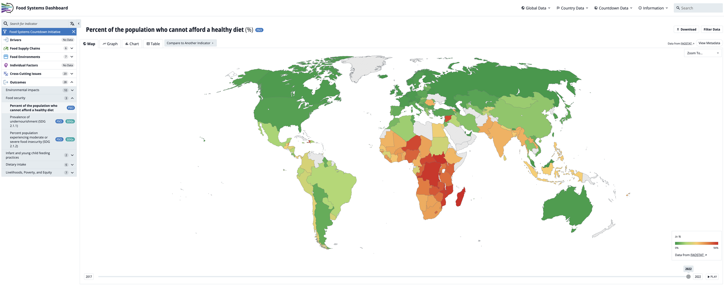
When I reflect on the origins of the Food Systems Dashboard and the Food Systems Countdown Initiative, it really began back in 2017. At the time, I was the team lead in developing the High-Level Panel of Experts (HLPE) report on nutrition and food systems. During that process, my colleague, Lawrence Haddad, the head of Global Alliance for Improved Nutrition (GAIN) who also served on the report, kept coming back to the same idea: wouldn’t it be incredibly useful to have a tool, a dashboard, that could bring together key food system indicators to better assess how food systems are functioning? Specifically, we wanted to understand their performance in terms of improving diets, nutrition, health, and environmental outcomes.
There was already a wealth of food-related data out there, of course — FAOSTAT being the most prominent example. That platform, managed by the Food and Agriculture Organization, offers a vast array of agricultural production and trade indicators. But what was missing was an accessible, visually engaging tool that integrated indicators across the entire food system — not just agriculture — and focused explicitly on outcomes related to diet quality, nutrition, and sustainability.
So in 2019, Lawrence and I decided to move from idea to action. We began building the Food Systems Dashboard. We brought on students and staff from Johns Hopkins and GAIN. Together, we started to build a platform that was both data-rich and easy to navigate.
We grounded the dashboard in the HLPE food systems framework — now widely recognized — which spans food supply chains, food environments, and consumer behavior, with outcomes ranging from nutrition and health to environmental sustainability, social equity, and livelihoods. Our first version of the dashboard included a modest set of indicators mapped to that framework, but it laid the foundation for what would become a comprehensive tool for food systems monitoring and decision-making.
Over the years, the Food Systems Dashboard went through many iterations — from shifts in design to new web development partners — as we refined both its functionality and user experience. Today, we’re proud of what it’s become: a visually appealing, highly interactive platform that includes over 400 publicly available indicators spanning the breadth of food systems. The dashboard allows users to explore global trends and diagnostics, as well as dive into subnational data for a growing number of countries.
One of our core priorities throughout has been accessibility. You don’t need to be a data scientist to use the dashboard. We designed it to be intuitive and user-friendly, making it easier for policymakers, researchers, advocates, and even the general public to understand how food systems are performing across nutrition, health, equity, and sustainability dimensions. It’s taken us six or seven years of steady development to get here, and the work is ongoing.
Then, in 2021, the UN Food Systems Summit took place — a pivotal moment for the global food systems community. But as the summit unfolded, it became clear that something was missing: an accountability mechanism. There was no system in place to track whether countries were making meaningful investments in their food systems, implementing reforms, or strengthening governance. We realized there was an urgent need for a global monitoring and accountability framework.
Drawing on the lessons from the Dashboard, we launched the Food Systems Countdown Initiative (FSCI), bringing together more than 40 food systems experts from every region of the world. Our goal was to design a scientifically robust, policy-relevant framework that could monitor progress across five critical domains:
1. Diets, nutrition, and health
2. Environment, natural resources and production
3. Livelihoods, poverty and equity
4. Resilience
5. Governance
We identified 50 core indicators and mapped them to these domains, creating a baseline for global food systems accountability. Since then, we’ve published a series of papers — starting with the architecture paper that outlined the rationale and framework, followed by a baseline assessment, and most recently, a trends analysis. Each peer-reviewed paper is accompanied by a more accessible policy brief to ensure broader reach and usability.
This year, we’re adding another key layer: benchmarks for each of the 50 indicators. These benchmarks help assess how far the world is from reaching key 2030 targets, highlighting areas of progress — and places where we’re falling behind. Keep an eye out for that paper when it is published later this year, early next year.
Together, the Food Systems Dashboard and the Food Systems Countdown Initiative offer two complementary tools for evidence generation and accountability. They help bring data to the center of food systems transformation — enabling better decisions, identifying where interventions are most needed, and holding governments and other actors accountable for action (or inaction). Ultimately, we aim to spotlight both the possibilities and the pitfalls — to show where food systems are delivering on their promise, and where deeper change is urgently required.
As food systems become more complex and interlinked, the tools used to measure and monitor them must evolve accordingly. In a new IFPRI publication—What do we know about the future of food systems—we call for a new generation of indicators and data systems that can capture the synergies, trade-offs, and dynamic interactions within food systems, while remaining transparent, interoperable, and policy-relevant. Our chapter highlights the role of initiatives like the FSCI to monitor global progress, and argues for integrating foresight modeling, historical data, and systems science into measurement efforts. Ultimately, we make the case for harmonized, forward-looking data infrastructure that enables smarter decision-making and accountability in food systems transformation.
Here are some resources where you can find lots of material on both tools:
Food Systems Dashboard website
